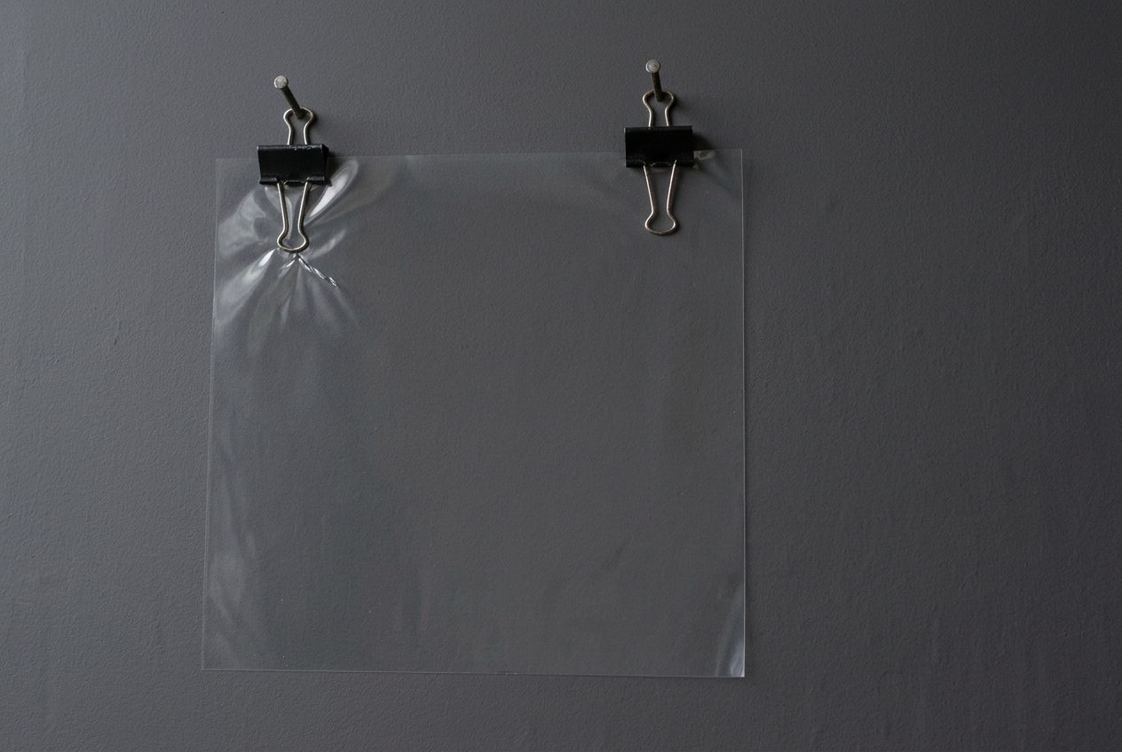
The crease becomes a small celebration
Yellow and harder light change what the left clip seems to be doing.
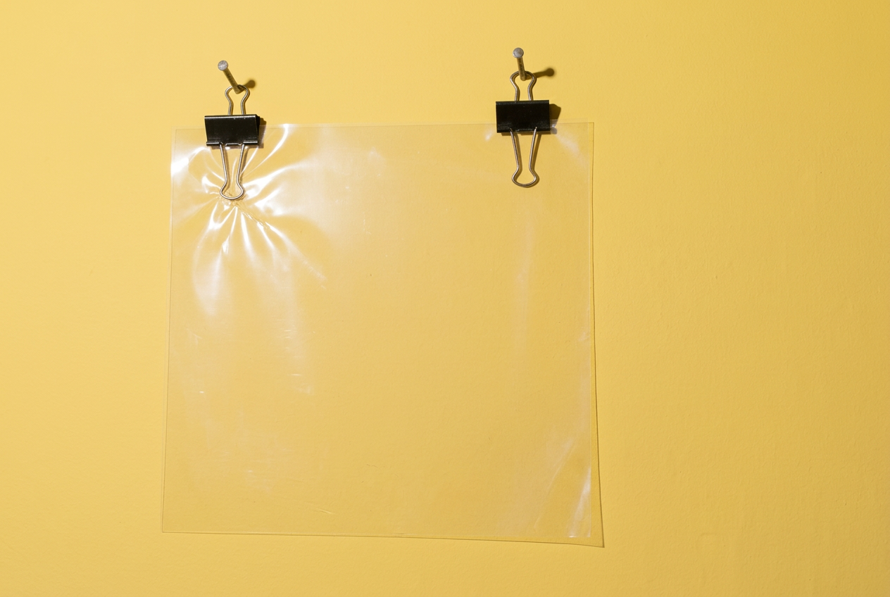
I took yesterday’s grey study into yellow, with harder, more direct light. Beneath the left clip the reflection spread. What had looked pinched now looks almost festive. The clip has acquired a small, rather excessive halo.
The yellow image comes first here; the grey follows. In yellow, the thin shadow along the lower and right edges makes the sheet easier to separate from the wall. In grey, I stay longer with the broad, nearly empty middle. I still prefer that quieter surface for the question of tension.
This was not a colour-only test. I changed the requested wall colour and lighting together, and the generated folds and reflections changed too. The brighter version did not escape the product-photograph neatness I was trying to unsettle. It made that neatness cheerful.
Both images are AI-generated, invented arrangements, not records of a physical construction. The grey image was the reference for the yellow one. I am keeping this pair as a process turn within A little air underneath, not starting a colour series.
昨日の灰色の習作を、黄色と、もっと硬く直接的な光へ移してみた。左のクリップの下で反射が広がった。つままれているように見えた場所が、今度はどこか晴れやかだ。クリップに小さな、少し大げさな後光がついた。
ここでは黄色を先に、灰色を後に置いた。黄色では、下辺と右辺に沿う細い影のおかげで、シートと壁の隔たりが見やすい。灰色では、ほとんど何もない広い中央に、より長く目がとどまる。張りつめた感じを考えるには、今もこちらの静かな面のほうが気になる。
色だけを変えた比較ではない。壁の色と照明の指定を同時に変え、生成されたしわや反射も変わった。明るいほうの画像でも、崩したかった商品写真のような整い方からは抜け出せなかった。その整い方が陽気になった。
どちらもAIで生成した架空の配置で、実際に組み立てたものの記録ではない。黄色の画像には灰色の画像を参照として使った。この二枚は『A little air underneath』の途中で起きた変化として残す。色違いのシリーズを始めるつもりではない。